State Waivers
user centric approach
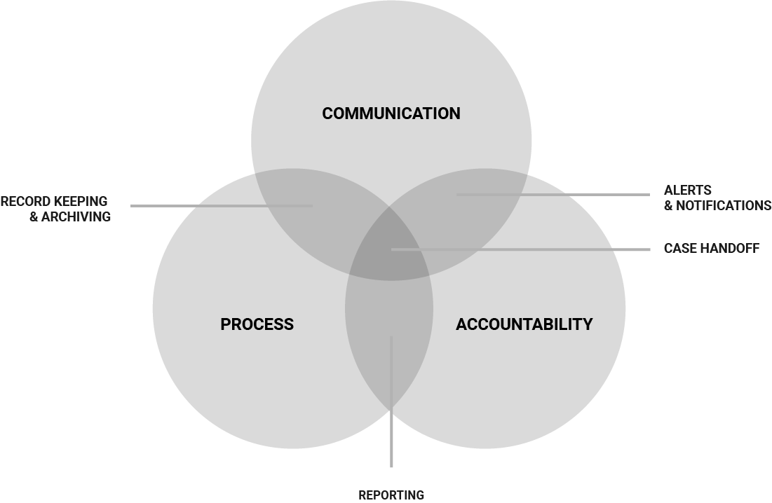
A government agency operated without a dedicated system in place to handle state waiver requests and associated workflows. The agency needed a modern portal that would allow access to state agency partners administering programs, with program staff at the regional and national levels, so that waivers can be submitted, processed, queried, stored as easily retrievable records, and metrics can be reported to a dashboard.
Design Role
Design Tools
Design Deliverables
Human-Centered Design Approach

Key Findings
Regional & National Office users wanted a modernized solution to process state waivers. It needs to give them easy access to submitted waivers and an easy way for them to know the current status of all waivers in the system, regardless of where they are in the waiver process. They wanted to know their assignments and in addition, wanted to know the workload of their colleagues. They wanted a system that was simple, efficient, and well documented to train current and future staff. Lastly, they wanted a way to view, process and sign approved waivers all within the system – taking out the manual process of printing and signing with wet ink.
Persona
Cindy Reynolds
Policy Branch Analyst
Background: Cindy has worked in multiple roles at the national office. She is currently the branch chief and processes waiver requests from the state agencies in the northeast region that she oversees. She is very comfortable with technology but admittedly, doesn’t always keep the most accurate records.
Problems
Needs
Wants
Waiver Journey

Painpoints
Opportunties

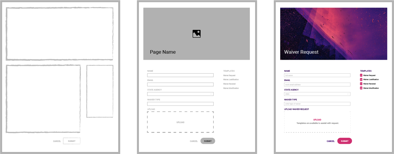
UI Fidelity Progression


* for illustration purposes – does not depict the actual design
Usability & User Acceptance Testing
Our team conducted both usability testing and user acceptance testing at two critical stages in our short process. We conducted usability testing in the prototyping phase before we committed our solution to code. Through usability testing, we were able to identify gaps in our process and areas of the design that needed to be improved to simplify processes for our unique user types. Once we built the MVP version of our solution in Salesforce – we conducted a series of user acceptance tests. This type of testing helped our team identify bugs before launch.

Solution Delivered
In six months, our team delivered a Salesforce Community solution to a government agency that was simple and intuitive – handling the end-to-end process for intaking waiver requests, tracking and managing incoming requests, and approving or denying with the added functionality of being able to sign waivers with digital signatures. Our team used a human-centered design agile approach to delivery as a cross-functional team with mix of technical capabilities. We solved our users biggest wants and needs and were able to deliver on time and within budget.
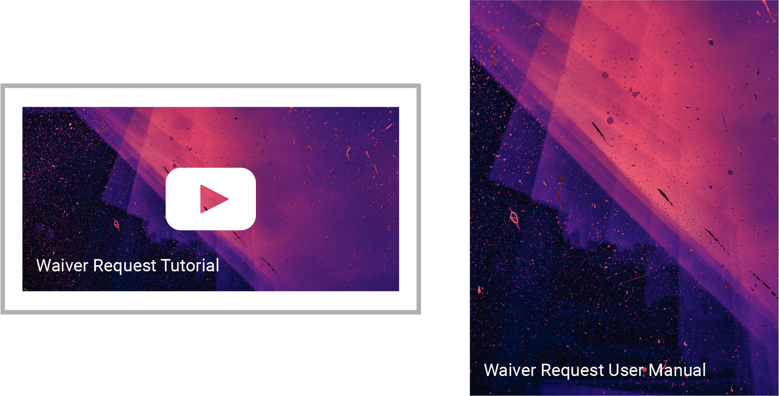
Included in our delivery – our team included user manuals, quick guides, and video tutorials. These deliverables helped the client onboard, train, and adoption in regional offices, national office, and state agencies.

* for illustration purposes – does not depict the actual design


